


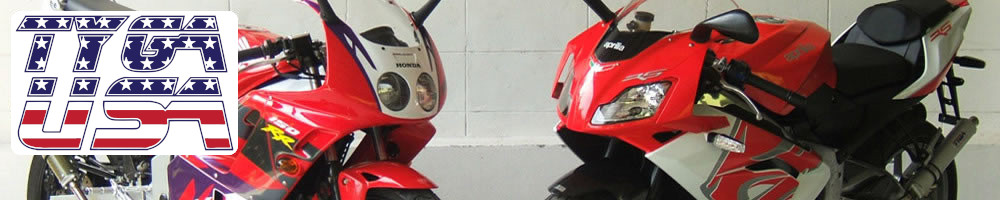


TYGA Paint
TYGA Performance Paint Scheme
February 2003

Have you ever wondered how paint schemes are designed on motorcycles? Most people take it for granted that bikes are available in the showroom in great color schemes which enhance the bike's looks. Unfortunately, it is not that simple and it is not until you start to designing a paint scheme from scratch that you realize there is a lot more to it than a few lines and colors. This is the story of the TYGA Performance color scheme.

So where do you start? In our case we started with the knowledge that we wanted to use our corporate colors and have a scheme which displayed our bodywork to its full. It had to be simple but instantly recognizable and easy to apply to different models. So we had something to work on. Now how to go about it....


I don't know if this is the correct way, but we went out and bought ourselves some big cans of emulsion paint, some brushes and some masking tape. The paint dried quickly so we were able to apply it and then repaint again and again in one sitting. The finish was very textured but it enabled us to see what a scheme would look like from all angles, quickly, cheaply and easily. Pictures show one of our early efforts. Other schemes had zig zags and stripes but we eventually after many evenings of emulsion painting came up with the scheme shown below.


We wanted to preserve the sandwich effect of the red and blue with a touch of white in between on our logo. However, we wanted to avoid stripes as being too conventional and stripes can hide the bodywork contours we were trying to promote. We therefore went for swooping triangular and round shapes. We kept the sandwich affect but more subtly


The front was actually one of the hardest parts to get right. It is very challenging to find an idea that doesn't look like another race team or production bike scheme. In the end, we settled on blue with a white under stripe tapering towards the center under the vent. This was echoed on the front part of the seat.
From the rear, the seat cowl design is extended over the tank, where the blue stretches out to full width to match up with the blue on the upper cowl.
The tank was also another difficult area to paint. Some of our early ideas made it look like an old EXUP or YPVS. The final scheme we settled on is a mirror interpretation of the seat cowl but the blue flashes that are on the lower edge of the seat cowl are absent from the tank.
Graphics on our NRS are kept to a minimum. We need to provide a decent size canvas for sub-sponsors and for racing numbers. The TYGA logo is very visible even from 50 metres away and should be instantly recognisable in a race.

We have applied a TYGA sticker to the tank but the jury is out on that one. Sometimes less is more!


Once we had settled on the paint scheme, we then had to choose the paint. After the first couple of sets, we have settled on candy blue with a bright solid red over a white pearl. Wheels are either white pearl or black as shown on the NRS.

- 1 x BPCG-0007 - Fuel Tank, Carbon, VFR750R RC30
$1,293.79US